
The process of visualising data in order to show patterns, trends, insights and anomalies is by no means a modern phenomenon. For much of human history, people have been using drawings and symbols to map or portray the world around us.

The earliest seeds of data visualisation can be seen in geometric diagrams, pictorial inventories, tables showing positions of the stars and planets and in the making of maps. The ancient Egyptians were known to use coordinates to map out their towns, and the positions of celestial bodies were being mapped by something approximating latitude and longitude by 200 BC.
The pioneers of modern visualisation techniques began to appear as early as the 17th Century, from John Ogilby’s Britannia Atlas in 1675 and Joseph Priestley’s 18th Century use of bar charts, right through to the likes of Florence Nightingale and Charles Joseph Minard.

Florence Nightingale’s ‘Coxcomb’ visualisation of causes of mortality in the army in the 1850s.
So while it’s certainly not a new discipline, the art of data visualisation has come a long way in recent years. From bespoke animations and motion graphics, static infographics or beautiful interactive infographics, we’ve taken data visualisation to a whole new level with the aid of modern technology. Not only are data visualisations as useful and informative as they’ve ever been, but they now often constitute stunning artistic expression; often resulting in something people are happy to have on the walls of their homes and offices.
To celebrate this, we’ve pulled together 20 of our favourite data visualisations from around the web, with a focus on those we find utterly beautiful.
1. Hello Sun
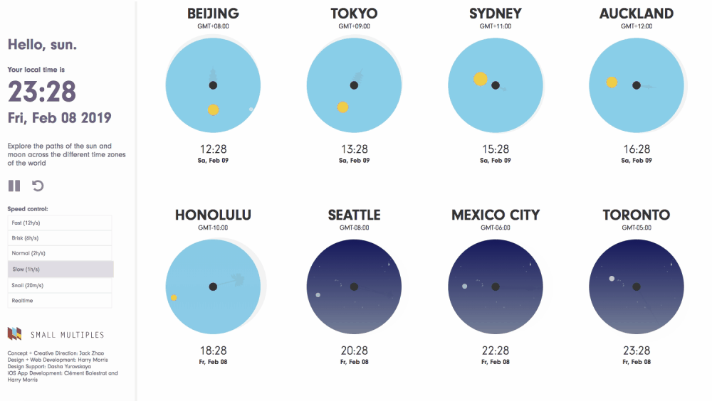
Created by Small Multiples, Hello Sun is a live data visualisation app for smartphones. Visualising the movement of the sun and moon in the sky over cities worldwide, the app uses beautifully simple animations and illustrated elements to display a wealth of information quickly and intuitively.
2. Apollo

Paul Button’s achingly beautiful visualisation of the Apollo space missions is available as a screen-printed poster, and the popularity of the print nicely demonstrates how the artistic appeal of data vis has evolved in recent years. A visual history of ever manned Apollo flight, the poster visualises ever major achievement through to Neil Armstrong’s iconic ‘One Small Step’.
3. Tommy Fleetwood’s US Open Performance

This beautiful poster from Matt Miller visualises every shot English golfer Tommy Fleetwood hit during the four rounds of the U.S. Open, when he hit a record-equalling final round of 63 (7 under par). The poster packs an incredible amount of information into a stunning design, visualising each shot, Fleetwood’s ‘Leave’ percentages and his overall ‘Strokes Gained’ stats for the Championship.
4. Fear and Loathing in Cinema

This fantastic interactive piece from Alexey Obzhorin is based on the idea that film genres are constructed in a certain way in order to evoke specific emotions. The project examines the top 250 films from IMDB, looking at how genres are combined, which topics are most commonly covered and how watching each of these genres effects the viewer psychologically.
5. Wind and Words

Designed by Impossible Bureau, the Wind and Words interactive visualises the dialogue from the iconic TV show Game of Thrones. Using intuitive and beautiful data visualisations, this piece visualises the interactions between the characters across all seasons of the show, including direct interactions, sentiment, vocabulary and more.
6. The Many Moons of Jupiter

Designed by James Round, this simple but beautifully effective poster visualises the different moons of Jupiter. Using an intuitive design system, this data visualisation displays each of the currently known moons, including the discoverer, year of discovery and a representation of the size of the planet.
7. Literary Constellations

Designed by Nicholas Rougeux, this stunning series of posters takes the words of the first sentences of each chapter in a number of classic works of literature, drawing paths based on speech and word length. The directions of the lines were based on a part of speech (such as verbs or nouns) and the length of the line is based on the length of the word, while the size of stars are also based on the word length. The resulting visualisation is a beautiful constellation poster, with 20 different titles - from Little Lord Fauntleroy to the War of the Worlds.
8. The Myth of the Criminal Immigrant

Produced by the Marshall Project, this superb piece of data journalism tackles the prevalent belief that immigrants make crime worse in the United States. While almost half of all Americans believe this, the data tells another story. This wonderful combination of journalism and data visualisation examines the relationship between crime and immigration in the US over the last 40 years, to see what the data tells us.
9. Oddity Viz

A collaboration between Valentine D’Efilippo and researcher Miriam Quick, Oddity Viz is an in-depth visualisation of David Bowie’s song, Space Oddity. This fascinating and beautiful series is made up of ten engraved records, each visualising one key aspect of the song, including narrative, melody, harmony, recording and more.
10. Visualizing The Beatles
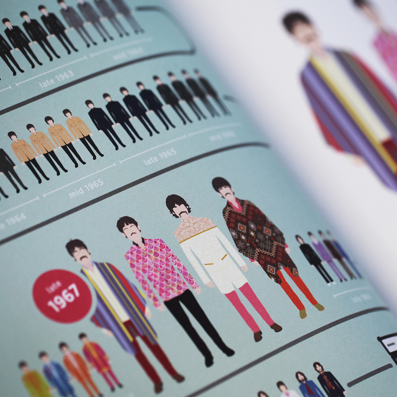
Designed by our founders John Pring and Rob Thomas, Visualizing The Beatles is a 300+ page book that tells the story of the world’s famous band in a way you’ve never seen it before. Using a combination of illustration, data visualisation and minimal text, this beautiful book examines each of the band’s core releases, from Please Please Me through to Let It Be. The book is now available in three languages, with unique versions for North America, Spain, Germany and the United Kingdom. The US version is available now from Harper Collins, and you can pick up it via Amazon, Walmart, Barnes & Noble and Visual Arcade.
11. Lessons From Those We’ve Lost

Another inclusion from data designer James Round, Lessons From Those We’ve Lost visualises over a century of extinction on our planet. As we place an ever-growing emphasis on trying to save endangered species, this post looks at what we can learn from those that have already gone. Using in-depth data visualisation, this wonderfull piece examines the nature of extinction in the time of humans, looking to identify the most common destructive forces and how they’ve impacted our planet.
12. Who's Who in the Marvel Cinematic Universe
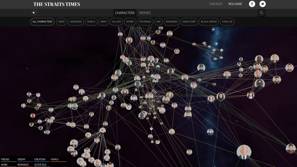
Developed by the Straits Times, this entertaining and engaging interactive data visualisation highlights the interconnectivity of all the Marvel movies, as well as giving you a short biography of each of the characters.
13. The Most Violent Cities In The World

A project from Federica Fragapane, this visualisation shows the 50 most violent cities in the world in 2017. Not only is the design beautiful, but Federica has managed to cram a huge amount of fascinating information into the visualisation. The piece explores the homicide rate of each city (per 100,000 inhabitants), the number of homicides committed, the region, country and variation in numbers from the previous year.
14. The Weather Radials Map

The Weather Radials Map from Timm Kekeritz visualises the weather in 35 cities over the course of an entire year, illustrating what it’s like to live in these cities, from Los Angeles to Reykjavik. Each city is presented as a single, unique radial visualisation, illustrating the climatic characteristics of each city across the four seasons.
15. 228 Years of POTUS

Another infographic from James Round, this data visualisation explores 228 years of America’s Commander-in-Chief. From the first President of the United States (George Washington) through to the present day, the POTUS poster charts each leader’s timeline, birth date, education, career and experience.
16. A Night Under The Stars

A visualisation from Jordan Vincent, this beautiful graphic explores overnight stays at US National Parks, from desert to coastal climates. Each visualisation plots the number of nights spent in each park and gives you four categories for accommodation: lodging, RV, tent and backcountry. Each radial visualisation shows you the popularity of each accommodation type across the four seasons, showing you the best times to stay at your favourite US National Park in your preferred accommodation.
17. Living Space

Created by Beyond Words for BBC Future, Living Space is a beautiful, engaging interactive piece visualising the International Space Station. Covering every element of the construction of the space station, this interactive utilises stunning illustrations and beautiful animations to tell the story in a unique, engaging way.
18. Trump’s Trade War
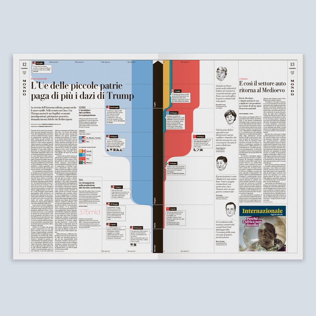
This elegant data visualisation was produced by Manuel Bortoletti for the La Repubblica newspaper. Showing the progressive expansion of the effects of Donald Trump’s trade war, it covers the impact on world trade from January 2018 to date. Not only is the visualisation beautiful and easy to read, it’s wonderfully incorporate within the copy, and the stylised illustrations of each of the key politicians just rounds off the piece beautifully.
19. Simulated Dendrochronology of U.S. Immigration 1790-2016

This utterly beautiful visualisation was produced by National Geographic and Northeastern University, using millions of data points from U.S. Census questionnaires. Using the powerful visual metaphor of the rings of a tree, the designers used a physics-based visualisation software to generate a series of stunning visualisations, including the one above. Each graphic shows an era of U.S. Immigration from different areas of the world.
20. Red Bull Event Personalised Visualisation

This innovative, beautiful series of visualisations was produced by Clever Franke, who used a combination of tracking and visualisation software to create personalised data art for each attendee at a Red Bull event in Amsterdam. During the event, guests were each presented with a bracelet that would track their movement throughout the venue, as well as their emotional state. At the end of the night, each guest was given their own print, based on their unique experience of the event.
If you’re in need of bespoke data visualisation for your brand or project, drop us a line on +44 (0)1432 839 461 or using the contact form, and we’d be delighted to discuss your requirements.
For more high quality visual content, be sure to sign up to the mailing list: